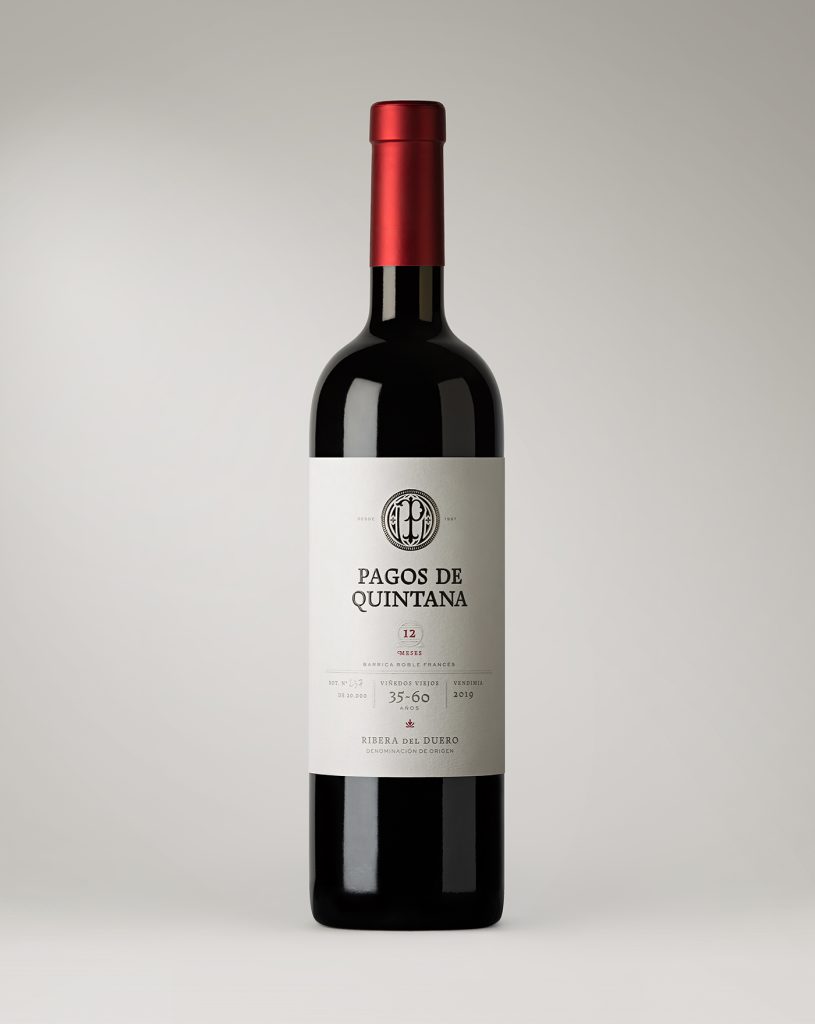
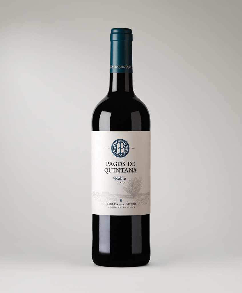
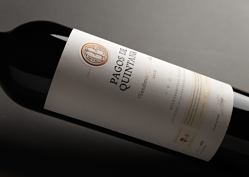
A project by the Pablo Guerrero Studio for the Pagos de Quintana winery —in the Ribera del Duero designation of origin.
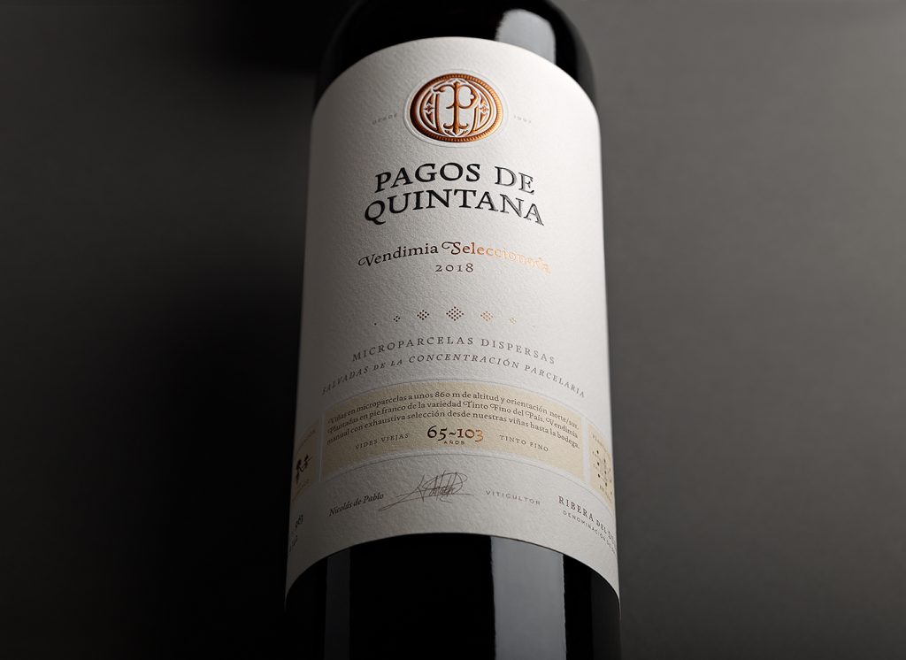
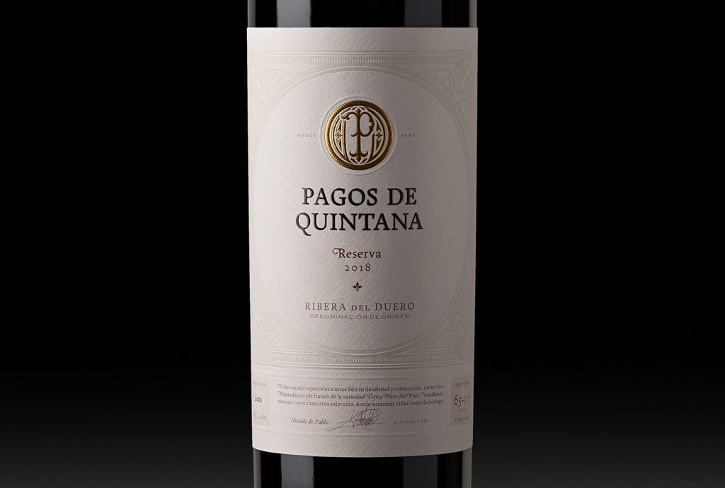
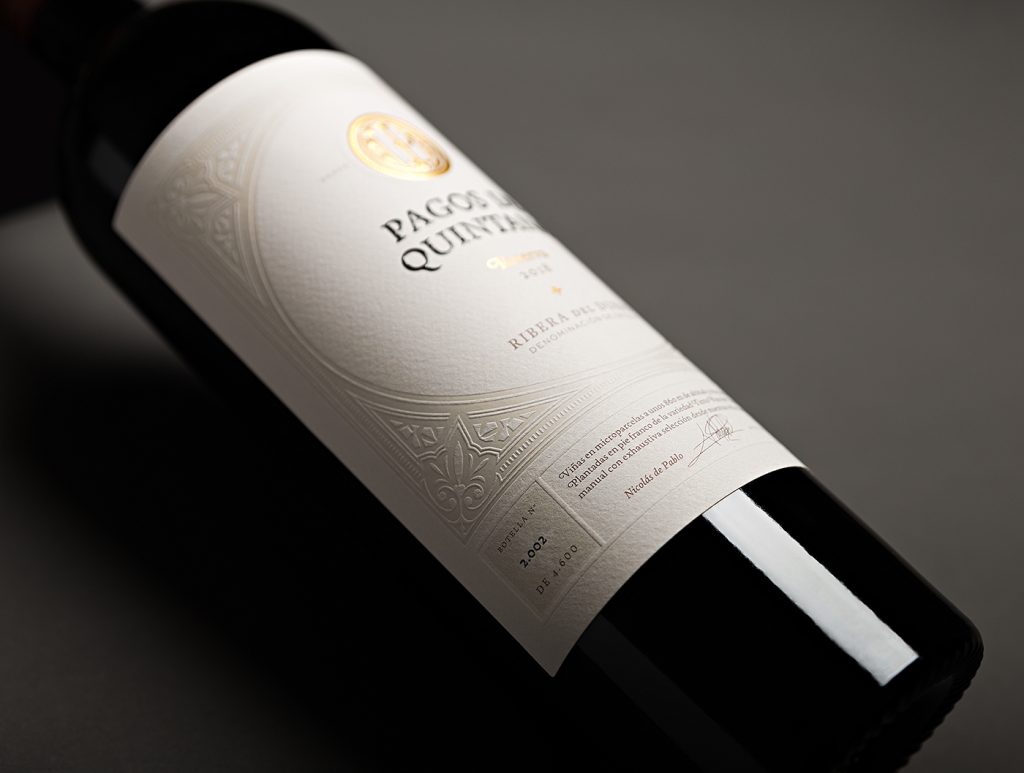
The town of Quintana del Pidio, where its vineyards are located, holds a rich cultural and historical tradition with a Benedictine monastery from the 12th century: a fact that also inspired the circular seal evoking their monastic heritage.
The essence of these castillian wines is well portraid via this old-style typography inspired by the Castilian literature; thus echoing a historical period where vineyards also thrived on the area.
Several paragraphs in the wine label play an instructive and pedagogic role, where Pliego adds to both the readability and appeal of the text. The capital letters and uppercase in the font are also rooted with the Castilian tradition, language and history.
Another key factor that prompted us to choose this font is the rhythm and quality of its figures, essential to express numerous characteristics of wines and beverages (such as alcohol percentage, vintage, bottle numeration, or months in barrel).
Pliego was combined (seeking a subtle contrast) with grotesque fonts like Sweet Sans.
Last but not least, a noteworthy feature of the font family is that it can nicely perform as a display font, as much as for body copy.