Articles
A new Scotch Roman: Schotis
Schotis story began in 2014. Ramón Penela, editor of Unostiposduros and a dear friend, had long wanted to make a type the both of us together. Together means I’m the doer and he puts the theoretical approach, and that means he doesn’t work at all. It’s just the Ramón way!
I told him of course, because I never say no to Ramon. But deep down I hoped that the matter would be forgotten since I did not really like working for months or years in another person’s idea.
But Ramon did not forget, and one day he sent me a huge emailwith a proposal: we are going to do a Scotch Roman, and he sent me specimens and texts so that I would be soaking up this style and its history.
From Scotch Roman...
The Scotch Roman typefaces are a strange case in the history of typography. Although they were one of the most used letters during the 19th and early 20th century, they don’t have their own place in the main typographical classifications.
They appeared at the beginning of the 19th century with Pica No. 2 in the catalog of William Miller (1813) and assumed the British route towards high contrast and vertical axis modern romans. In fact, they were called just Modern. As opposed to the continental route of Fournier, Didot, and Bodoni, the English way opted for a wider, more legible letter also resistant to bad printing conditions.
Perhaps because it was immensely popular and used in cheap printed matters —the same that William Morris roared against—, the typographic historical canon somehow ignored the Scotch and the modern continental Romans took all credit. They even baptized the style as Didones (Didot + Bodoni). All this history makes the Scotch Romans a less known style and, to a certain extent, with few digital versions compared to its European cousins.
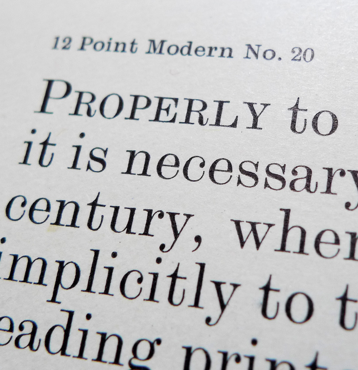
Printing Types. Stephenson Blake & Co. Ltd.
I liked this story of the misunderstood type style, even some formal features of the Scotch were in other of my types. But to start a project I need something that makes it mine, that would give me fuel for months or years. A mental click that forces you to make that typeface, and usually that has to do with the possibility of nice letters and funny stories.

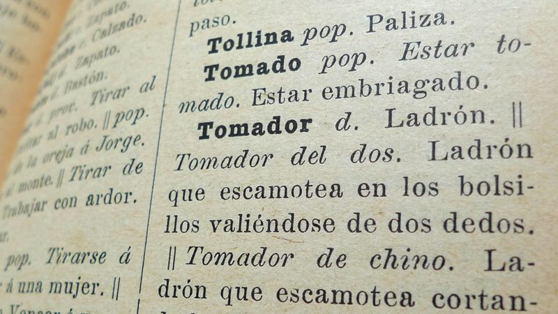
Diccionario de argot español. Manuales Soler.
...to Schotis Roman
There were two coincidences that convinced me that I had to do this typeface. The first one was the finding of an old book in Madrid’s flea market: Diccionario de argot español (Spanish Slang Dictionary). It was a hilarious wonder-book found among a collection of clumsy early-20th century books that, of course, was set in a Scotch Roman face.
Seeing that the majority of the slang I use today is a century years old at least, somehow connected me with the book and with the fantastic look of those letters printed in the yellowish pulp paper. Even the book was printed on Molas street in Barcelona, that also means You’re Cool street in slang!
The second thing that convinced me to work in this typeface had to do with the name. For me, a good name brings a lot to the character of a typeface. In this case, any name related to Scotland would inevitably be a not very original googled cliché. Then I remembered an information that few people know (until now).
At the end of 19th century, there was a trendy high society dance called the Scottish. In several parts of the world that dance reached the popular classes that transformed the dancing and its music in different ways. In Madrid, its name became Spanglish and it was changed to schotis. Now it is known simply as chotis, a kind of slow dance whose lyrics deal with pimps and girls.
The coincidence between the Scotch Roman and the slang and popular dance of my city were, to me, so amusing that I simply couldn’t say no to this typeface. And this is how Schotis started.
Three years later, here is Schotis, a true workhorse suitable for editorial uses a wide arrange of Latin based languages.
I have avoided the exaggerated crispy shapes and contrast of the 19th century Scotch Roman style to achieve a modern look and better legibility at small sizes in Schotis Text, leaving the fun drawing for Schotis Display.
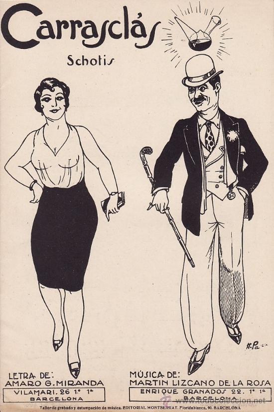
Old schotis score.

Schotis Text has an extended character set for European languages as well as Vietnamese, and shows all its potential with OpenType-savvy applications. Every font includes small caps, ligatures, old style, lining, proportional and tabular figures, superscript, subscript, numerators, denominators, and fractions.
Take a look at Schotis Text page for test and licensing
