Articles

Share on facebook
Share on twitter
Share on pinterest

From Woodtype to Show

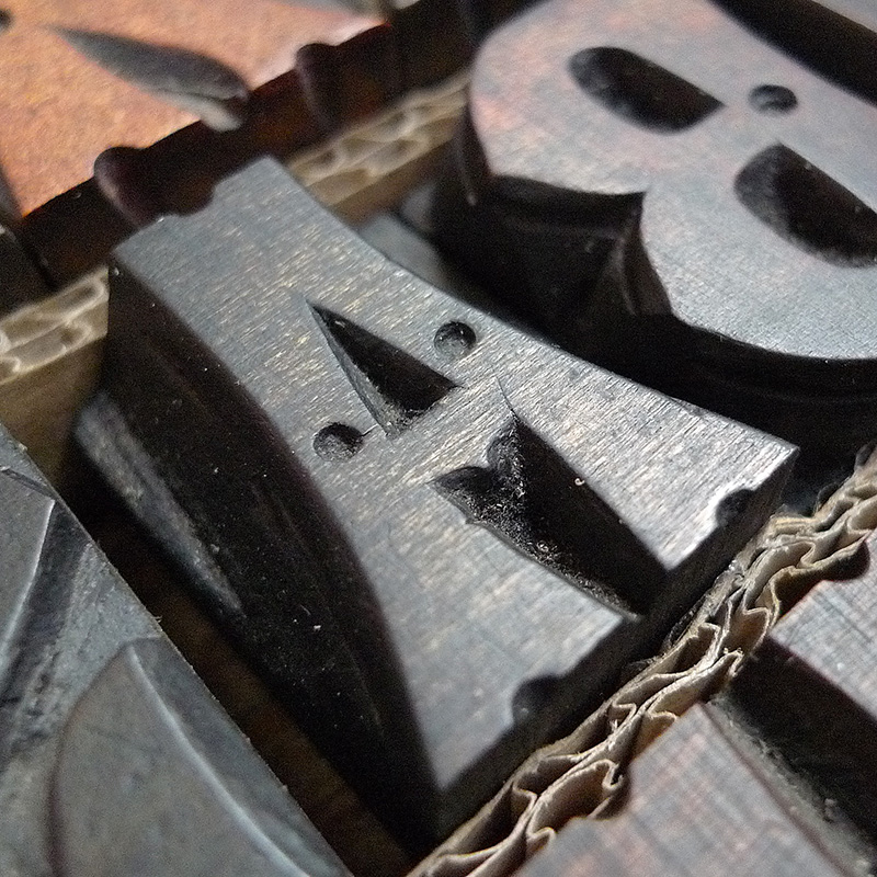
Inés Atienza and me are members of the Familia Plómez association, a small printshop based in Madrid that devote their efforts to promote everything about letterpress printing, calligraphy, and lettering.

One of our favorite typefaces from our collection of wood types has been the basis for creating a new digital typeface. All we knew about this font when we first came across it was that it was found in a basement on the Canary Islands, however its origin or manufacturer remained unknown.

We started searching in old specimen books, and we came to find out a type family called Concave, a Victorian type launched in 1889 by the foundry Marder, Luse & Co. This style was probably marketed by several foundries (if we can talk about foundries in wood type) and we don’t know how those letters ended in Canary Islands.

Woodtype
Marder Luse Specimen

Chicago Type Foundry. Abridged Specimen Book of Printing Type from Marder, Luse & Co. Type Founders. 1889

So, after using it on several letterpress projects, we thought we would have a go at digitizing the original type, as well as giving it a multilayered chromatic style to make the resulting digital woodtype font more versatile and complete.

What’s a chromatic typeface?

Although it might seem as if chromatic or multilayered typefaces are a current fad, they have been part of printers’ collections for centuries.

In the nineteenth century, with the advent of the Industrial Revolution and the need for new typefaces that would capture the attention of new consumers, chromatic wood types became widely popular. All manufacturers strove to compete in showmanship; William H. Page’s 1874 specimen is one such example of this opulent style.

Chromatic type is printed from multiple pieces of type, each with a different ink; each color is the result of the sheet of paper making a separate pass through the press. These chromatic types were designed to register as much as possible, repeating only a part of the design and allowing the user to even create colors by mixing superimposed parts.

Chromatic Woodtype

Specimens of chromatic wood type, borders, etc. manufactured by William. H. Page & Co

Digital Woodtype

We use a similar method in the digital realm. There are two kinds of layers: ones designed to be on the bottom (3D, shadows, etc.), and ones that are meant to be kept on top.

The placement (or registration) of the new layer of type is much simpler than in letterpress: simply copy and paste your text in exactly the same place, and change the style and color. Once you start experimenting, there are endless possibilities.

Layered Type

Using Show

Our woodtype font Show has 13 layers and an extended character set to support Central & Eastern European as well as Western European languages. It includes monetary symbols and complete punctuation.

As the original font lacked a lowercase, we have replaced them with small caps, which can be used either in conjunction with the caps or independently.

Read, Try and Buy Show!

Show Layers

Take a look at Show page for test and licensing