Articles

Share on facebook
Share on twitter
Share on pinterest

Designing a Revival: Graveur

Graveur is a literary and magazine type family rooted in French Renaissance style. Based on original material by Robert Granjon, it interprets and expands it to obtain a new design, useful for the needs of modern designers. With four optical sizes and seven weights plus italics, Graveur will match any of your needs.

Hey, Christoffel!

In 2018, I joined the Expert Class in Type Design (EcTd) at Plantin Institute of Typography in Antwerp, Belgium. The classes are conducted by Dr. Frank E. Blokland and the course is held in the Museum Plantin-Moretus.

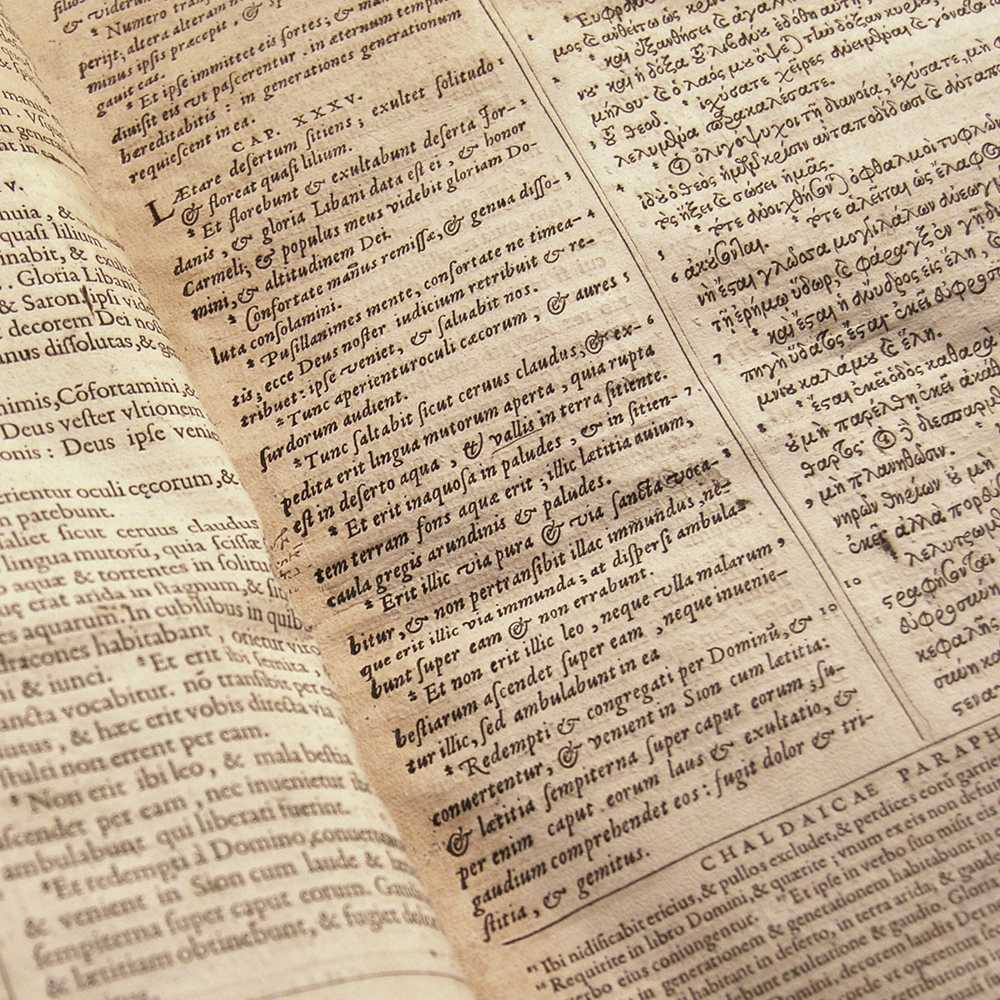
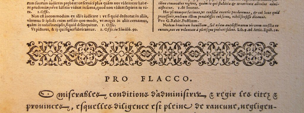
Christoffel Plantin (1520-1589) was a French printer and publisher who founded his printshop, the Officina Plantiniana in Antwerp in 1555. Plantin was maybe the most prolific printer of his time, when the aesthetic and economic center of Renaissance printing moved from Germany and Italy to France and the Netherlands.

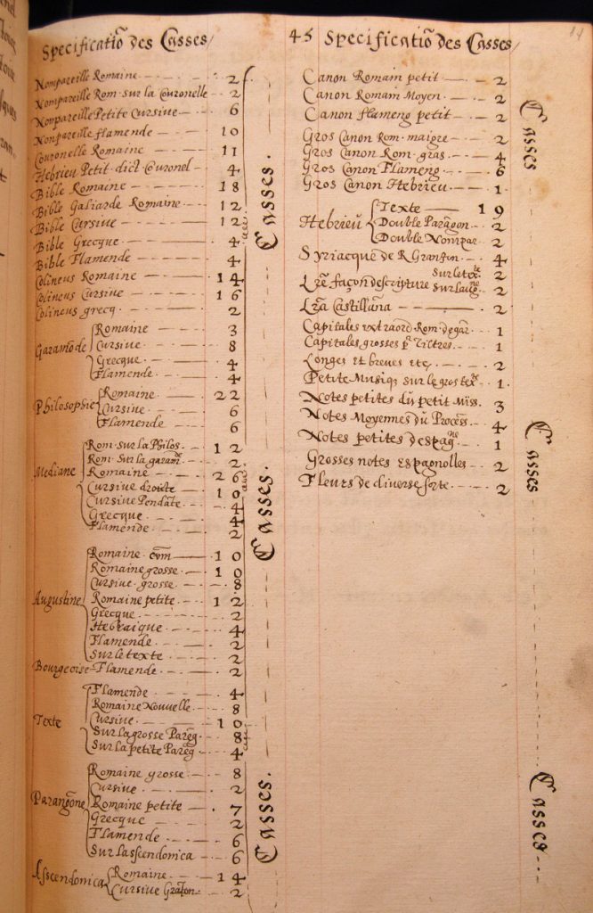
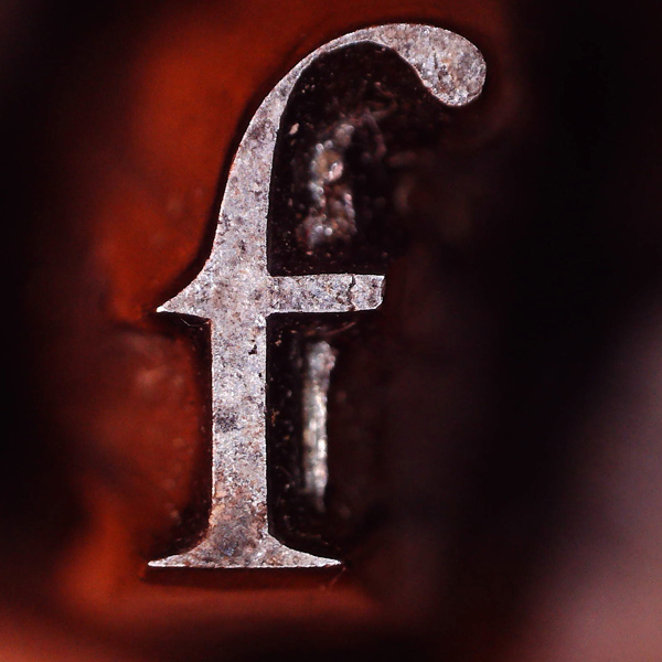
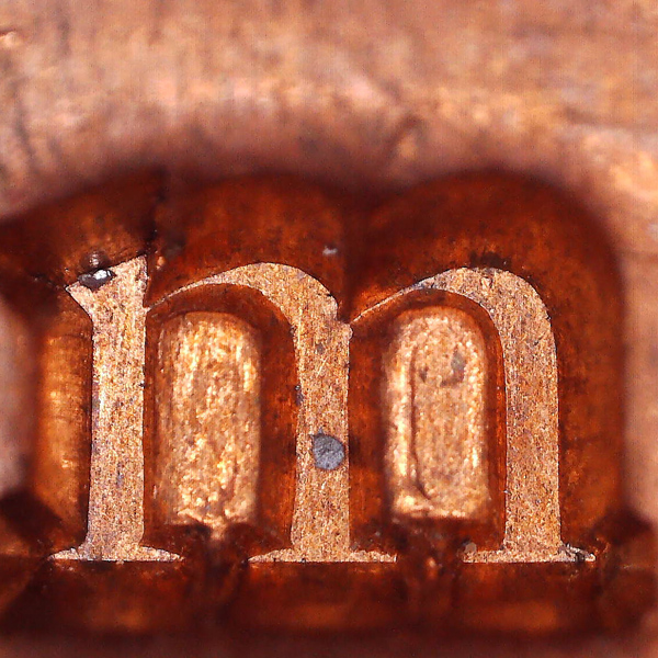
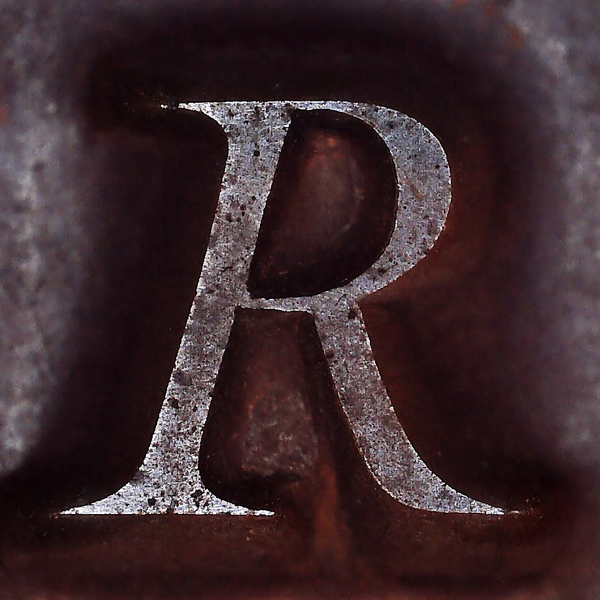
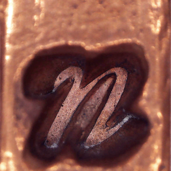
By the time Plantin began his activity the printing trade also had changed from a beginning in which all crafts, from punchcutter to editor were part of the same company, to a stage with different companies and freelancers offering their skills in an European market. Punchcutters keep their precious punches and sold sets of matrices to different foundries from all over Europe, which in turn distribute lead type to local printers.

Big players like Plantin could even order exclusive bespoke punches to meet the requirements of important customers, and even buy matrices to set an in-house foundry. This way Officina Plantiniana gathered over the years an enormous amount of original material from the best Renaissance French and Flemish type designers. Many other printers used lead types from Haultin, Guyot, Garamont or Granjon, but it is the copper matrices and the steel punches that can survive heavy use for centuries, while the worn lead type is melted down.

Frank Blokland EcTd class

Ikarus system demostration by Frank E. Blokland at EcTd class.

Plantin’s son-in-law Jan Moretus and his descendants ran the business already in decline, preserving the historical material until they sold the old building with all its content to the Antwerp city council in 1877, becoming the Plantin-Moretus Museum. In the middle of the 20th century, scholars like H.D.L. Vervliet, Mike Parker and Harry Carter digged into the huge amount of material and cross-checked Plantin’s log books with the collection of punches and matrices to confidently attribute most of the matrices and punches to their designers.

EcTd course discusses different topics about type design, such as Blokland’s theories about standardization in Renaissance font production and the way to standardize some processes on today’s digital font production workflow. Although the subject of the students’ project is free, it seems logical to take advantage of easy access to the collection of books, punches and matrices in the Museum’s library and try to do a revival as your personal project.

Plantin Logbook

List of all the type cases in Officina Plantiniana.

Another Revival? Really?

Type design is a funny business where we call industry to clean offices with a couple of designers with laptops, there are foundries that do not melt anything and copying somebody’s work is fine.

All those things have to do with technology changes. We digital workers still use cool industrial terminology and we also adapt old analogic designs for new digital customers, and that’s what we call type revivals. The word revival suggests taking something back from the death, like a typeface that just didn’t make it to the next printing technology and still looks terrific in old books. By reviving it we can make it available for modern use.

Revivals are a favorite matter of discussion in type design. Depending on the ethical and aesthetical way to approach the sources, John Downer has classified them from Recuttings to Knockoffs, passing through Tributes or Parodies. Robin Mientjes proposes the word Translation, as revivalists are moving an old design to a different time, environment or culture. Anyway, designers’ attitudes when facing the work of a colleague from another century are endless and difficult to classify.

First of all, why on earth make a typeface that has been made and even revive by other designers? Well, musicians have been playing the same symphonies for centuries and nobody seems to ask them that question. What’s more, connoisseurs can perfectly distinguish how each conductor makes completely different music with the same score and they even have favorite interpreters.

I am not a classical music fan, so I will give a more rocker example: some years ago I went to Surforama, a Surf rock music festival in Valencia. There were dozen of bands playing surf and garage rock classics, arguably some of the funniest and grooviest songs to play and dance. Well, although all the bands were technically proficient and they really loved the music, there was a huge difference in the way they played Surfin’ Bird or Louie Louie, from mechanic and boring to passionate and lively. And the best bands had used that heritage to evolve and create their own music, quite different from those standards they didn’t play anymore. John Downer could have classified rock covers in the same categories as type revivals.

I once thought it an admirable thing to do – to reproduce old type-designs – but they simply don’t do it. They [guess who, dear reader] only give you a good, stiff, unfeeling rendering of a good model, with practically all its beauty and humanity eliminated.
Bruce Rogers

Type Revivals can take many paths, we can aim to slavishly reproduce a specific historical font, or we can try to capture the spirit of a designer or whole genre with plenty of room for subjective interpretation. When I had those Antwerp punches under the lens, I could see Renaissance type wasn’t exactly as I expected. Lots of mechanic and normalized revivals had hide lots of exciting shapes and for sure there was room for another take. I just wanted to draw a Granjon cover that could make you dance.

Why Granjon?

Choosing a focus for a project among the wonderful artifacts from the Museum Plantin-Moretus was a real challenge. In my case, I was lucky that it was partly the material that chose me.

Years ago I bought a book from 1726 at the Madrid’s flea market. Thanks to the research material from the library, I was able to identify the fonts used in that book as Robert Granjon’s (1513–1589). I was impressed that these faces were still in use in Spain two centuries later but copper matrices last forever when used in hand moulds. It was no less interesting to see Granjon’s romans (I must confess that my illusion was to find Garamond’s type). By studying surviving artifacts from Granjon with a microscope I was able to discover the mastery and grace of his work, and it was harder for me to understand why Granjon is like a second option for Renaissance romans.

Regarding Renaissance types, the designer who set the archetypical model for roman type was Claude Garamont (1499–1561) while Granjon was the punchcutter that set the standard for italics although he also cut romans, civilités, greek, music types, oriental scripts and ornaments in his prolific career. Granjon’s romans have been obscured for centuries by the success of his colleague and that had an immediate appeal to me.

Garamont for the guy and Garamond for the type, OK?
The d comes from signing as Garamondium, a latinized form of his name. Also he published Portuguese editions as Garamontio, nice free name for the next take on his work, fellow Portuguese speaking type designers.

At the beginning of the 20th century some of the first conscious type revivals were Garamond roman types (mostly based on wrong non-Garamond sources) with Granjon’s italic counterparts. Garamond’s name was so overused that Linotype choose Granjon’s name for another Garamond’s revival. The first all-Granjon revival was the splendid Monotype Plantin, but it’s based on a specimen set with right and wrong a’s, and of course they choose the wrong one.

Granjon Ascendonica Punch

Maybe this extra a in Granjon’s Ascendonica Romain punches is guilty of Monotype Plantin’s wrong a?

Granjon Ascendonica Cellophane

It’s a Match! Cellophane smoke proofs allows to identify printed material.
Red text is Ascendonica Romaine by Granjon (note the spreading of red ink comparing with black smoke proof).

After the 1950s, research on Plantin-Moretus artifacts and archives allowed type designers to work on a new wave of Renaissance revivals, taking advantage of punches and matrices now rediscovered and attributed to their true creators. Thus ITC Galliard by Matthew Carter, Romaine by Aad van Dommelen or Allrounder Antiqua by Moritz Kleinsorge are true Granjon’s revivals. My Graveur is another take on Granjon’s work based on original material. I’ve tried to recover his style avoiding preconceived ideas about how a Renaissance letter should be, because in front of those artifacts, we often try to find what we know instead of letting them do the talking.

Of course, there is not one Granjon typeface, there are dozens of fonts and his style changed over time. By choosing a model and drawing the letters, a revival is a continuous decision-making process, a strange mixture between the desire to be faithful and the inevitable betrayal of the original (Traduttore, traditore!). In my case, my goal was to make a clearly recognizable and lively Granjon typeface, although for this I have to betray him once and again.

Granjon Ascendonica Punches

Ascendonica Romaine, 1569. Robert Granjon.

Lowercase g and most figures are missing. I have omitted updated extra instances of M and a but I have included punches like J, U and W which I believe are later additions.

Betraying Robert

The roman type in my book was a quite worn out Mediane Romaine and as it wasn’t the best example of Granjon’s work, I decided to mix two different and better models: Parangonne Romaine and Ascendonica Romaine, the favorite choice for revivals because of its big size (18,5pt) and astonishing mastery.

Choosing italics were a different matter because Granjon changed his style several times and there is a lot of difference between different fonts and sizes. Fortunately my book’s italic was the fantastic Texte Cursive from 1562, known as pendante or couchee, a really vibrant font but with a narrow and awkward uppercase, so I borrow uppercase letters from Ascendonica Cursive, a better companion for my upright capitals.

Granjon Punch 2

Ascendonica Romaine, 1569

Granjon Matrix 2

Parangonne Romaine, 1566

Granjon Punch

Ascendonica Cursive, 1570

Granjon Matrix

Texte Cursive, 1562

Texte Cursive in Plantin’s Polyglot Bible or Biblia Regia (1568-1573).

It’s easy to spot because it’s the only Granjon’s italic with four ampersands. Can you find them?

Ampersands

Having access to the original artifacts and microscope images makes you think drawing process is going to be a piece of cake. It is not difficult to place nodes following the contour, even with missing parts out of focus or hidden under centuries of dust. But here comes a surprise: tracing nice models does not necessarily result in nice shapes and somehow strong and graceful metal letters became lame and weak digital counterparts. Something was really wrong with it, so I decided to stop tracing and start drawing freely with an open image side by side, trying to capture what made those shapes so suggestive even if the contour changed.

Graveur - First drawings

This was one of the endless aesthetic decisions that make each revival unique. Even with the best quality model, room for subjective interpretation is huge. Each revivalist (or translator) is going to be forced, even if doesn’t want to, to fill countless questionable areas with decisions based on their intentions, backgrounds, predefined ideas or personal taste. And each path we choose inevitably leads to another decision and, in my case, each time I moved away from the literal copy my typeface began to come together and to resemble what I saw in those punches and matrices.

Apart from drawing decisions, there were many more to take: Should I fix manual work inconsistencies? Should I replace old-fashioned letterforms? Would Granjon have extended the family? I’ve done it, of course. After all, it’s a revival, not an autopsy.

From the beginning, my aim was to design a contemporary Granjon revival suitable for modern purposes. That raised a discussion with Frank about what makes a typeface contemporary. After all both faithful and free revivals can be equally useful for today’s needs so it’s not so simple as adding straight lines and corners here and there to get a modern look.

Of course, today it’s mandatory to design different weights and a larger character set than Granjon had to cut. Users expect to set text in lots of languages, to highlight texts with bolder weights and since 2016 even using a variable font to choose the perfect density for their paragraph. Graveur covers about 223 Latin languages with 1189 glyphs (1416 in italic) and goes from Book to Heavy weights, with Book, Regular and Medium as running text weights with a subtle variation.

Graveur Weights

Punches were different for every size, due to relative size of ink spreading small ones having less contrast and bigger ones showing their fine details. To match this Graveur has four optical sizes, with Display weights based on original punches and matrices showing very thin and contrasted shapes, and Small sizes take into account ink spreading in printed materials, with wider letterforms, higher x-height and looser spacing. Most of the first 20th century revivals were based on bigger (and easier to photograph) sizes, so they look very light at small sizes in modern printing. Graveur’s four optical sizes allow users to avoid this and maintain the text texture at any size.

Comparison between matrix/Display size and smoke proof print/Subhead size

Graveur - Optical Size

Graveur Display  · Subhead · Text · Small

Optical Size 2

To give designers full control over weight and optical size, Graveur has variable fonts available. This font format can store a whole family of static fonts into a single font file, allowing designers to use any instance of the design space instead of choosing between static predefined weights and optical sizes.

Rag

Variable fonts can be designed for novelty or experimental purposes, but in Graveur the idea is to fine tuning weight and optical size parameters to get the perfect paragraph texture.

Old punch cutters used counterpunches or patterning models to give consistency to their work, but even Granjon could have had a bad day or make mistakes in a hurry. Maybe I sometimes spent the morning digitizing the result of a hangover and it’s up to me to use digital tools to make choices to get a more consistent family. To use nodes and BCPs without destroying the charm of a hand-filed shape is the real challenge that I hope to have overcome.

I also wanted a typeface with a higher x-height, maybe less elegant but for sure sturdier and more economic. Plantin himself commissioned Van Der Keere a set of shorter ascenders and descenders for pairing with Gros Canon Romaine by Garamont, resulting in a new higher x-height font so it’s not a contemporary idea, but it fits with contemporary tastes.

Granjon matrix

World is not ready for that w, maybe a later addition by an unknown punchcutter.

Some odd letterforms needed to be reworked. Uppercase J and W weren’t in use in 16th century and the punches that were added later to the original sets are sometimes even fun to watch. Some letters seem to have been added to replace broken originals and others are designs like Œ that today would draw a lot of attention in running text. I wanted to give users the opportunity to choose the old forms so all those characters are preserved and accessible through OpenType features.
OpenType Features

Original forms on top, default forms below:

Stylistic Sets

· Modern Œ, mandatory in heavy weights
· Alternative f to fix spacing problems
· Garamondish ? by default (sorry Robert!)
· Less slanted A, V and W.
· Conventional v, better for spacing
· Original v at the beginning of words

Printed material is the real output of a typeface, but having the opportunity of researching punches and matrices gave me an insight of what shapes the punch cutter wanted to get. Some of those details are obscured even in very well printed material and have been substituted over the years by preconceived forms. Reviving those details result in sharper and more distinctive letters. I decided to embrace distinctive shapes instead of smooth them into a standardized Garalde archetype font for the sake of consistency. And, especially on italics, I think that attention to the original charm is what really gives Graveur a contemporary look.

Granjon Drawing

I would have drawn an oval counter, but the microscope revealed a beautiful corner, difficult to appreciate in printed material.

Ornaments and Fleurons

All Graveur fonts contains a complete set of manicules, fleurons and ornament patterns, divided in the same way of lead originals to combine freely.

Also, there is a special Ornaments weight to access them through keyboard in applications without a Glyphs panel.

Ornaments 3
Granjon Ornaments
Ornaments 4
Antwerp Lace

Antwerp lace in the manicules!

Graveur Ornaments

Graveur

After a year and a half of global pandemic due to covid-19, that 2018-2019 course full of flights to Antwerp to meet fellow students from various countries seems like something from a previous life. Releasing Graveur, which I mostly worked on during lockdown, somehow closes this awful year and feels a bit like finally taking off my mask to get back to normal.

Being a student abroad again and working with another designer’s ideas has taught me a lot about type design and Graveur is the result of this journey. I hope I have done my part to expand the possibilities for today’s designers to continue to use the work of Robert Granjon and Renaissance type.


Labore et Constantia

Graveur was cut and designed between 1562 and 2021 by Robert Granjon & Juanjo López.

A big shout out to my classmates: the Russian Gang, the Italian Mafia, the Brazilian Samba and the Clockwork Oranges. Thanks to our teacher Dr. Frank E. Blokland, to Jan van der Linden from the Plantin-Moretus Institute and to some Antwerp bartenders. And many thanks to the patient guys from the library, to Harry Carter, Mike Parker and very especially to Hendrik Désiré Louis Vervliet.

Cheers to my betatest designers: Nico García, Sergio González, Diego Obiol & Diego Areso.

All the images were taken by EcTd 2018-19 students (I’m pretty sure best of them are by Misha Strukov).

Online articles, a lecture and some books about type revivals:

Galliard: a modern revival of the types of Robert Granjon (Matthew Carter. Visible Language, vol.XIX, no.1, 1985)

Call It What It Is (John Downer. Emigre, 2003)

Reconsidering Revivals (Robin Mientjes. ATypI 2020 All Over)

Revival Type: Digital Typefaces Inspired by the Past (Paul Shaw. Yale University Press, 2017)

Type Revivals (Jerry Kelly. Godine, 2019)

Reviving Type (Céline Hurka & Nóra Békés, Acute Publishing, 2019)

Take a look at Graveur page for test and licensing