Typeface Info
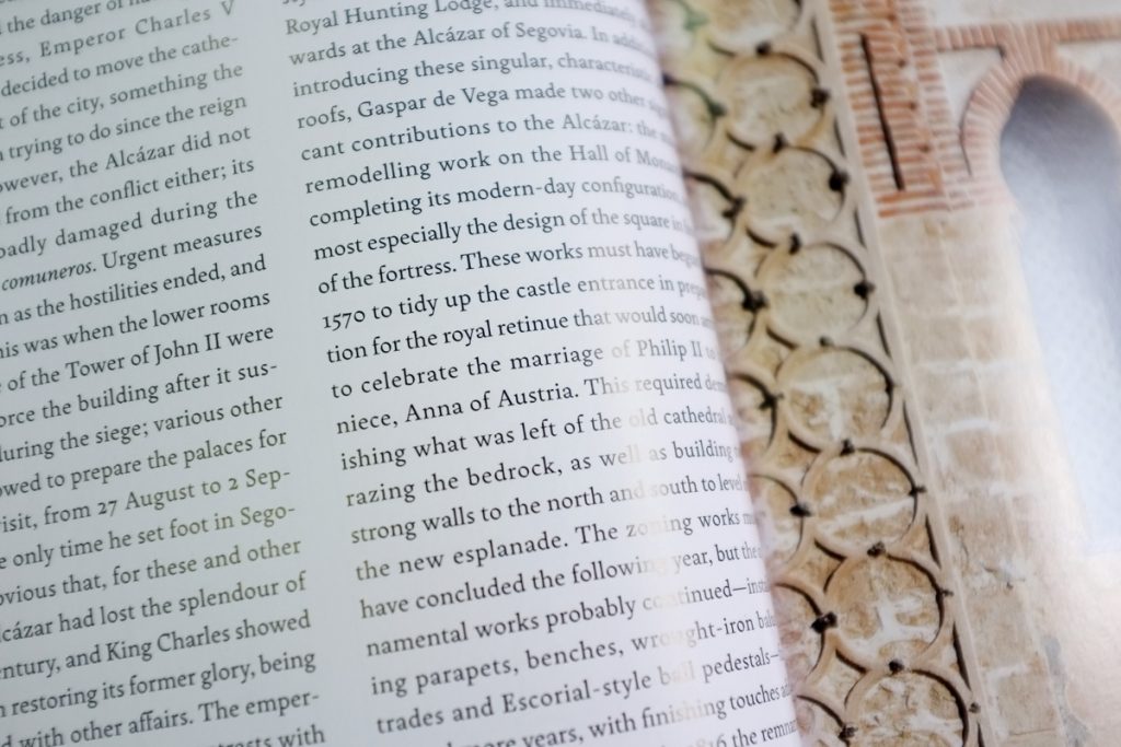
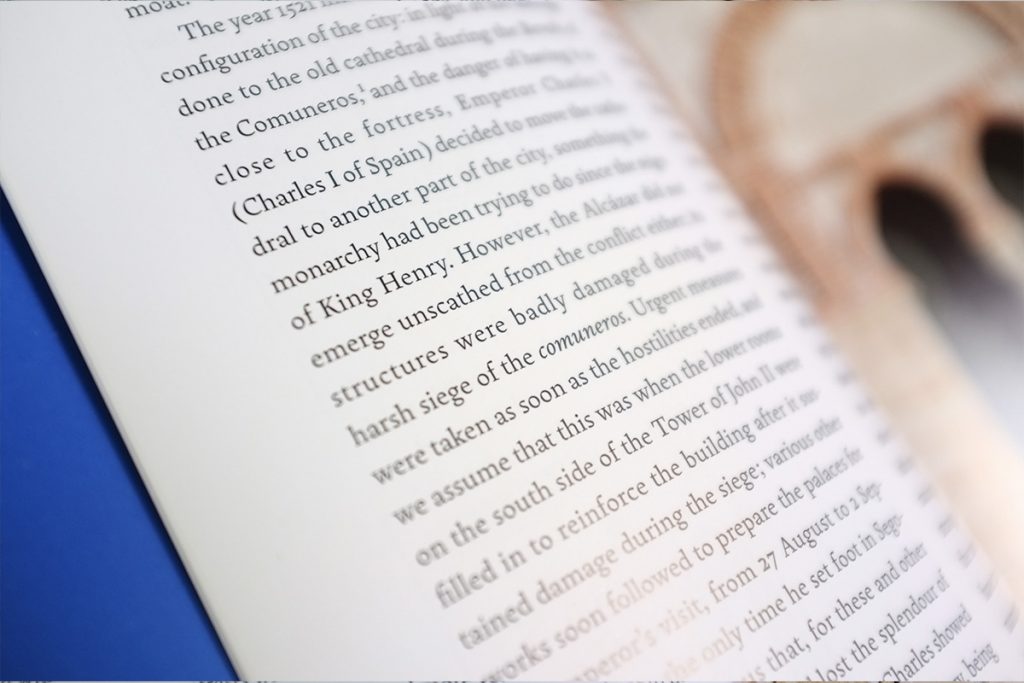
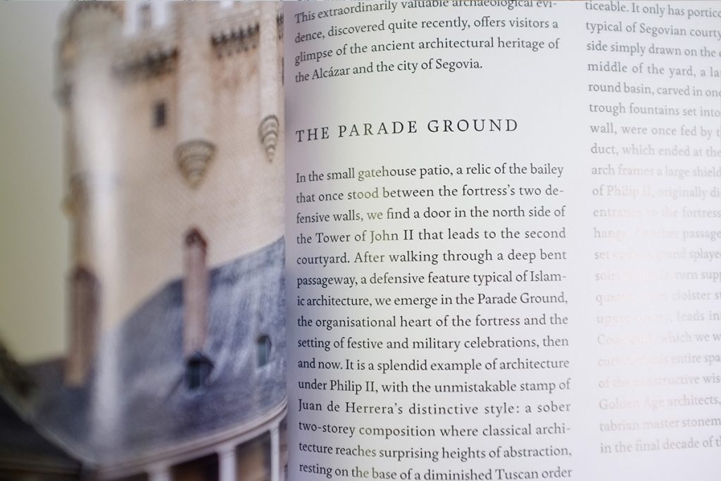
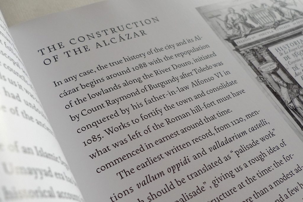
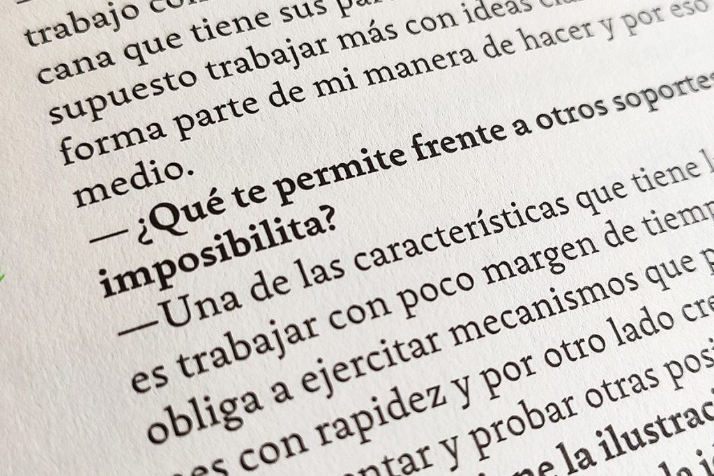
Pliego (Spanish for Spread) is an humanist serif crafted for a long reading experience. It has rough angular shapes with unexpected details, but its proportions are inspired by Venetian old style serifs and help to set running texts with an even and readable paragraph texture.
This contrast is visible used at big sizes, where Pliego can show off its witty and fearless personality, with lots of ornamental features.
To cover today’s needs, Pliego includes five weights with matching italics. Designed and engineered for continuous reading, the Book, Regular and Medium weights will perform at their best under 14 points. However, don’t be scared to use for headlines and titles: because of its quirky details and calligraphic flavour, Pliego’s personality is accentuated when enlarged.
With an extensive Latin character set, Pliego covers a wide amount of Latin-based languages, including Latin Plus encoding and Vietnamese support.
Every font includes small caps, ligatures, swashes, old style, lining, proportional and tabular figures, superscript, subscript, numerators, denominators, and fractions.
Read more about Pliego design process or scroll down for Styles, Test Samples and detailed Buying Options.
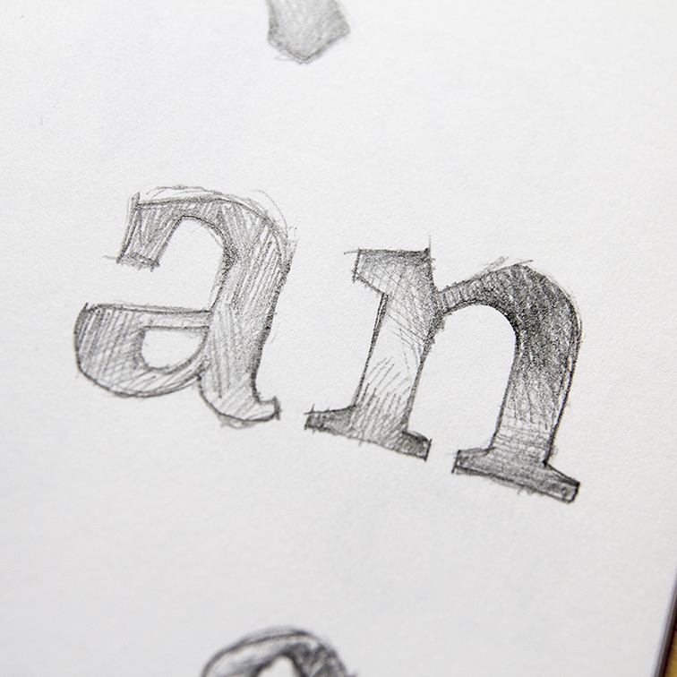
Pliego 5 weights + italics. 10 fonts
Glyphset 1211 glyphs
Designed by Juanjo López
Year 2018
Styles
Test
Buy
Here you can purchase licenses for Pliego.
Bundles available in Pliego:
Pliego Family (10 fonts): From 120€
5 weights + italics.
Pliego Basic Family (4 fonts): From 80€
Regular, Italic, Bold & Bold Italic.
All bundles includes my Font catalogue for free.
Please contact me for extended licenses.